A refreshed brand identity, website, and mobile experience for the first comparative news platform created to help readers think freely about the issues of our times.
GROUND NEWS
2021
ROLE
Brand Identity, Art Direction, Product Design
CREDITS
Colin Leary, Brand Strategy
Corey Upton, Design
I. IDENTITY
Ground News has positioned itself as the world's first information utility by equipping their readers with diverse perspectives across the political spectrum and providing bias ratings for news outlets and their stories alike. We were challenged to create and design a new brand identity for this informed news consumer. In partnership with Corey Upton, we reimagined a new visual identity and designed a web and app experience that reflected Ground's newly refined mission 'to well-inform the world'.
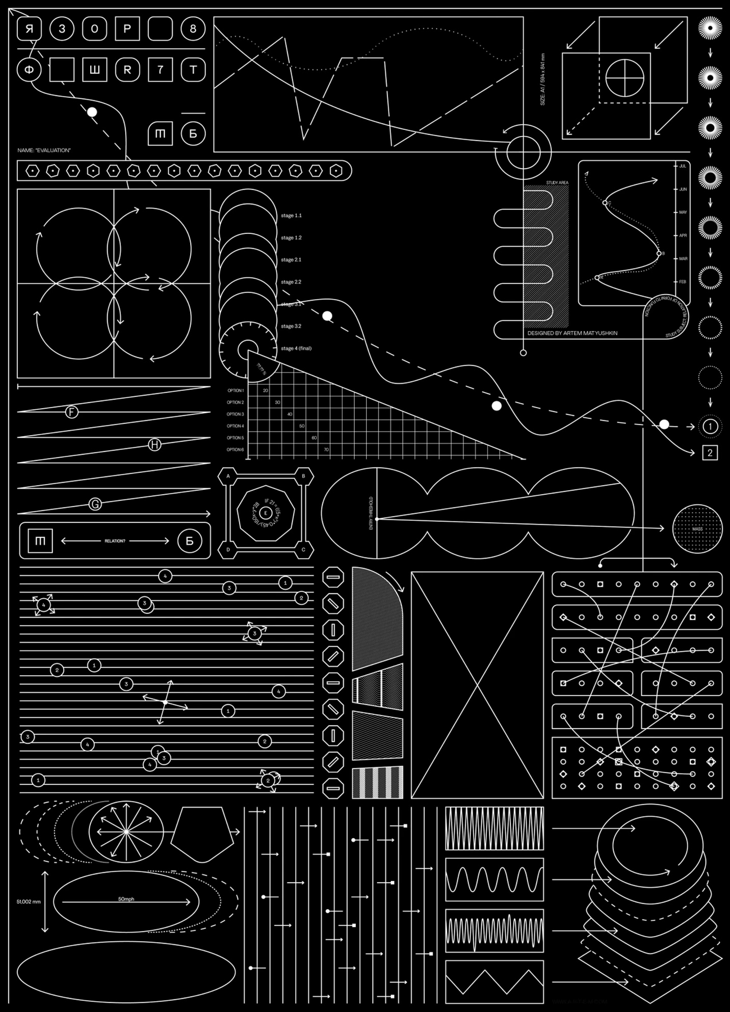
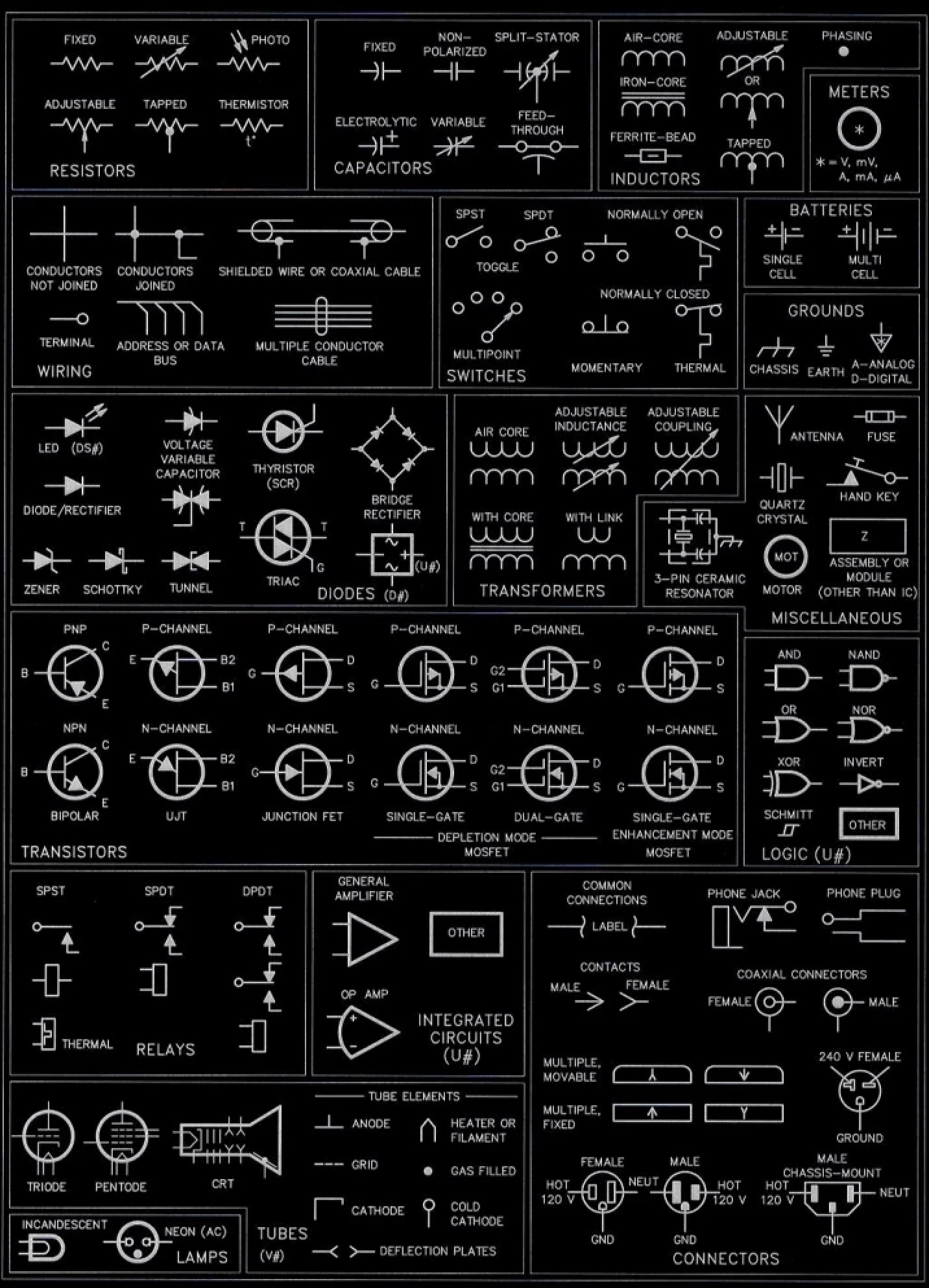
[fig. 2] Schematic references
With the belief that news transparency is and should be available to everyone, we were drawn to the utilitarian design language found in schematics and blueprints. Referencing these intuitive systems paved the way for our foundational brand elements.
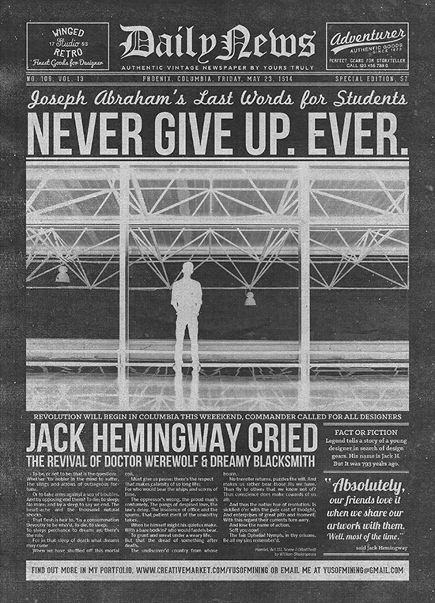
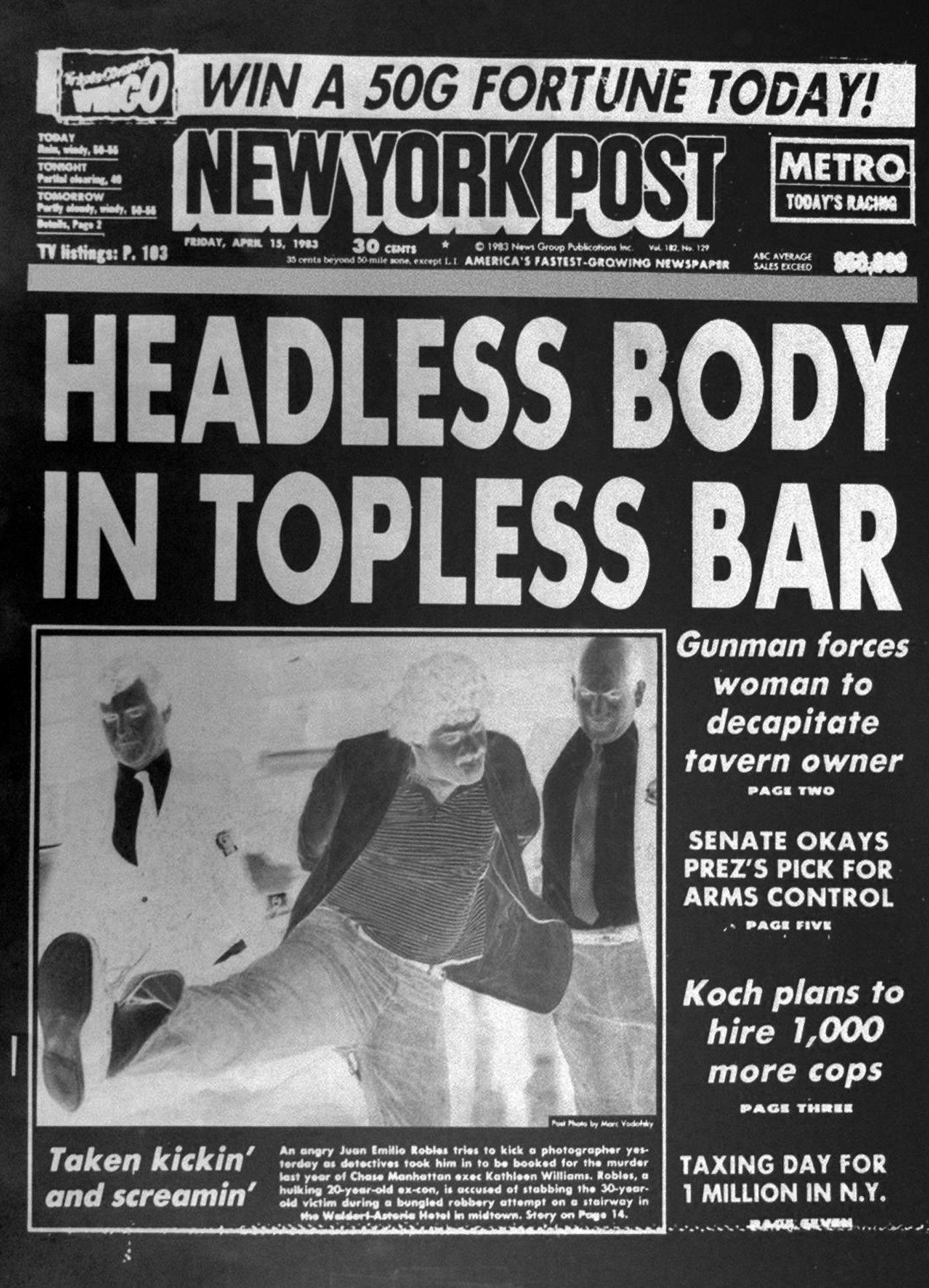
[fig. 3] Typographic references
Wanting to add depth and additional narrative to the identity, we also looked to the typographic treatments used in news headlines in print media with the hopes of creating something ownable and new in the digital news media space.
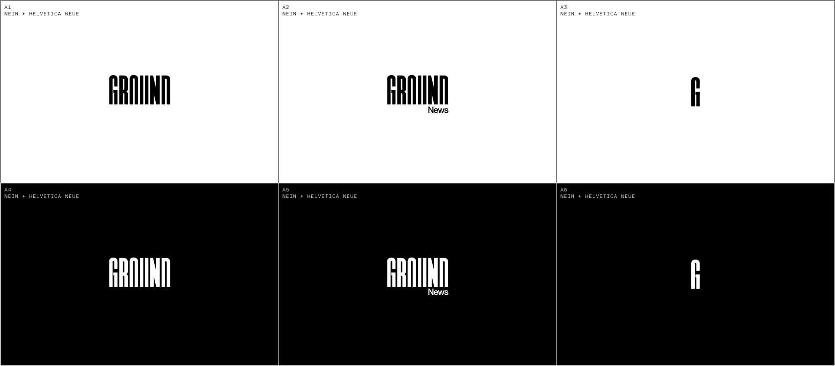

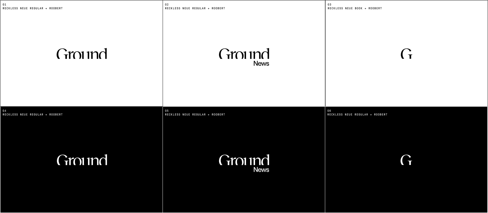
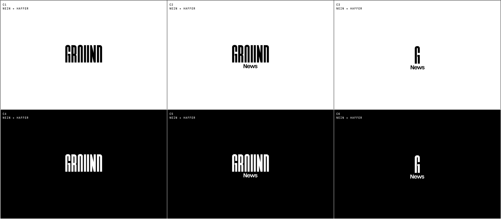
[fig. 4] Wordmark explorations
Cropping the letterforms in such a way as to create a sense of implied line resonated with the team, as they fondly talk about Ground News readers as being 'grounded'. This motif became a visual representation for the state of mind of a Ground reader — intellectually sturdy in their beliefs yet willing to explore new perspectives.

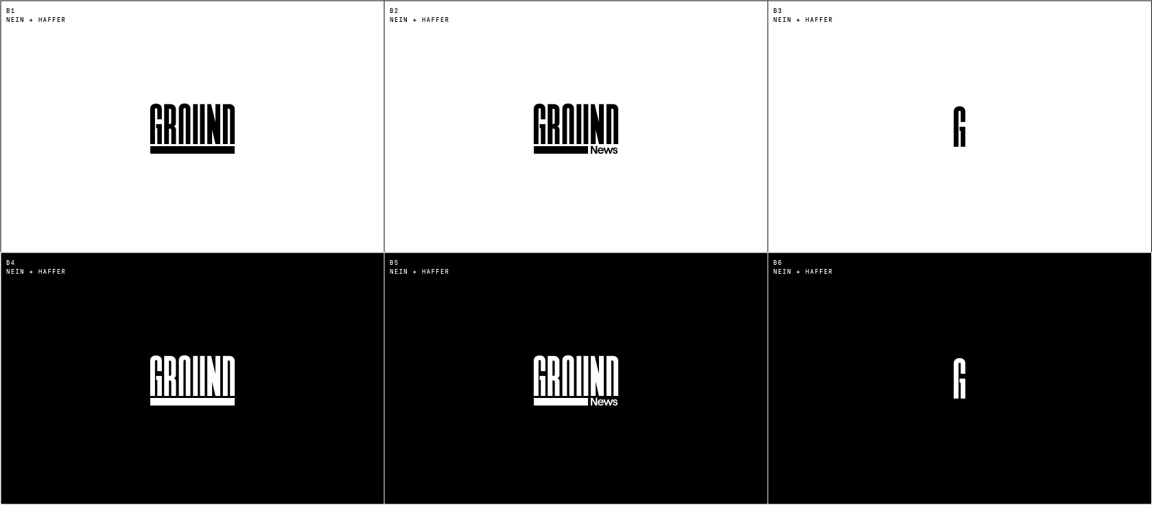
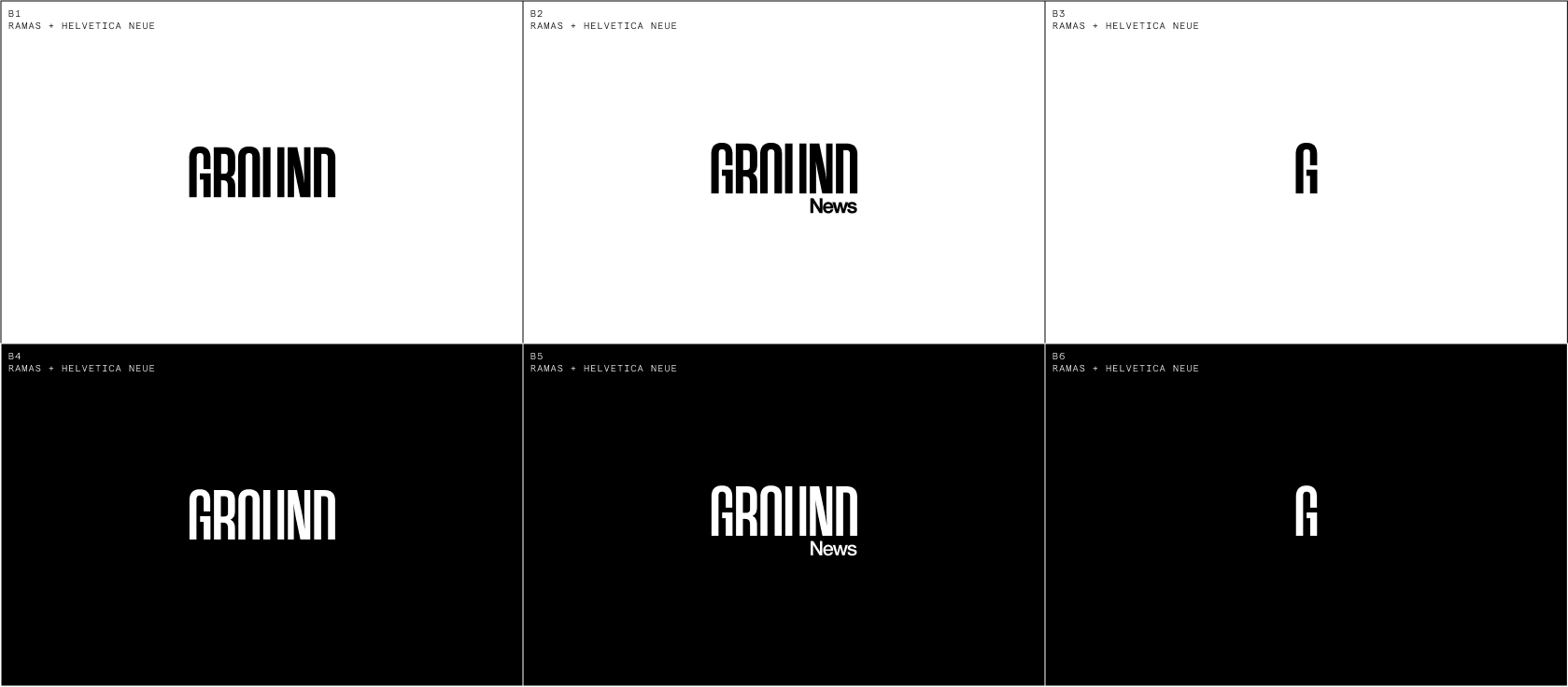
[fig.5] Ground News identity system
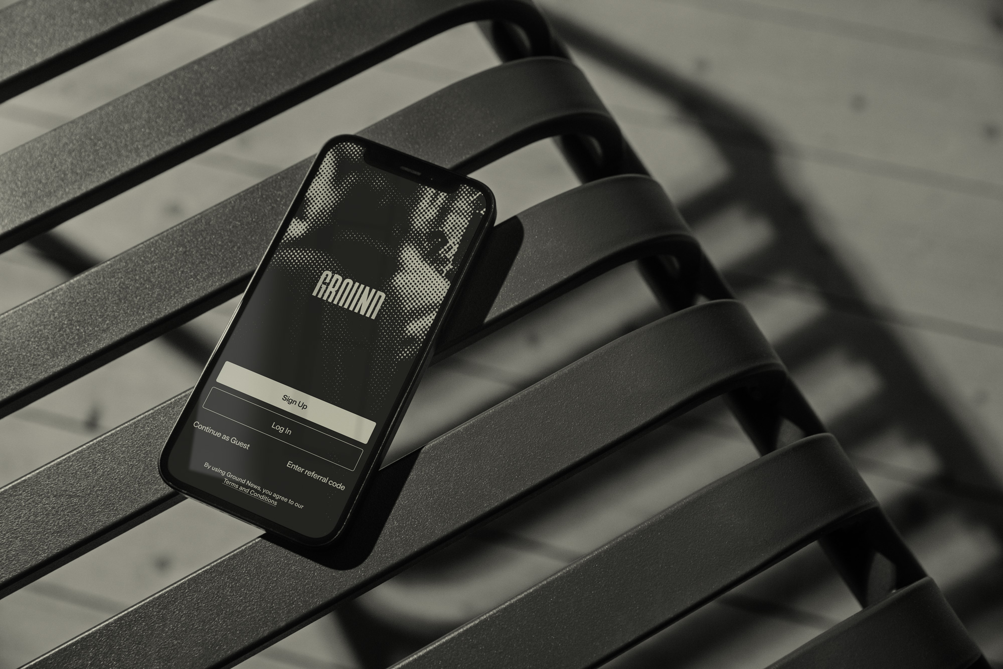
We eventually landed on a mark that embodied the core values of the brand and stood out amongst other digitally native news products. The identity system included two variations of the mark, monogram, and app icon.
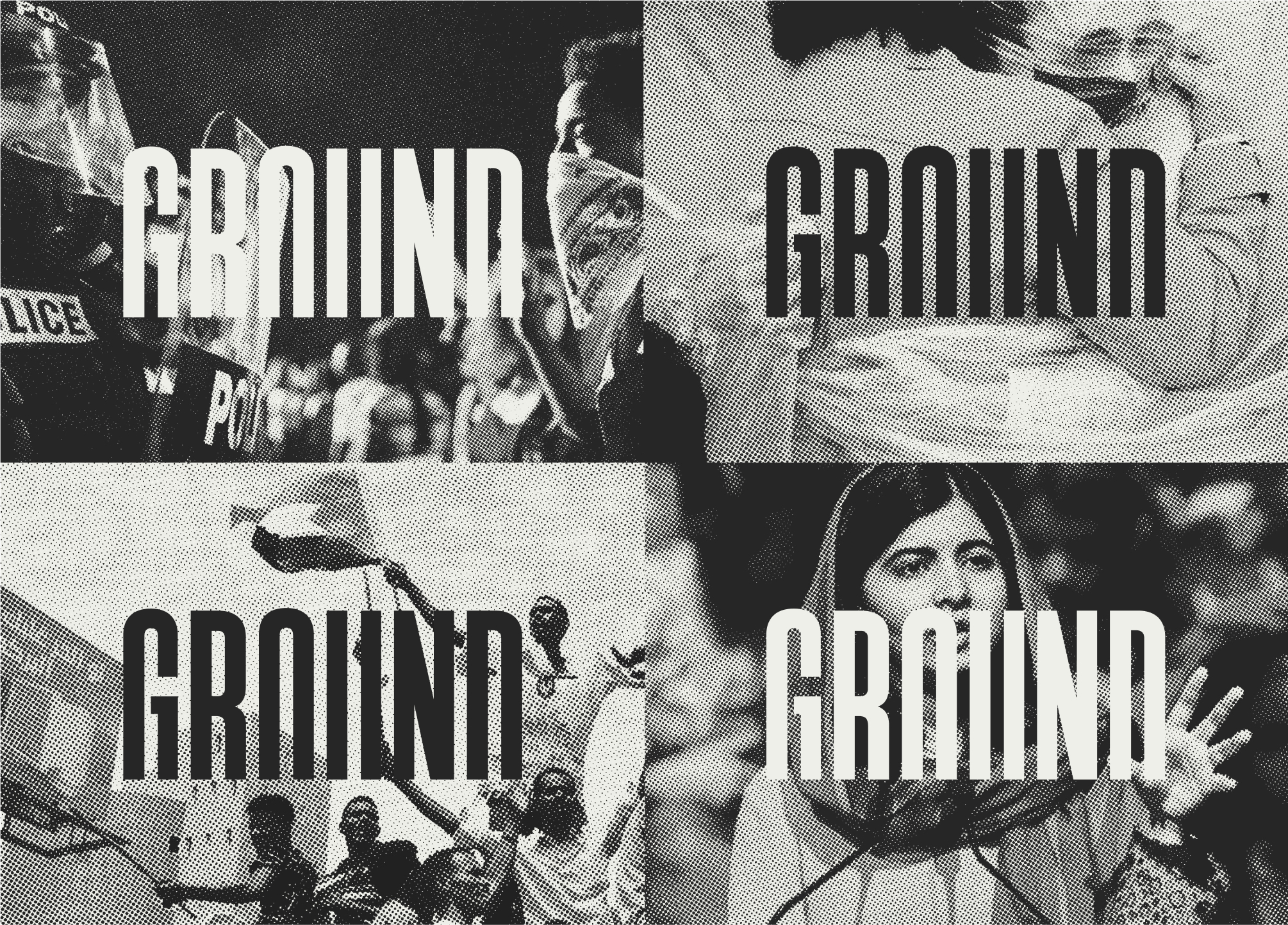
[fig.6] The new mark accompanied by images using the custom halftone pattern created for the brand
II. DESIGN SYSTEM
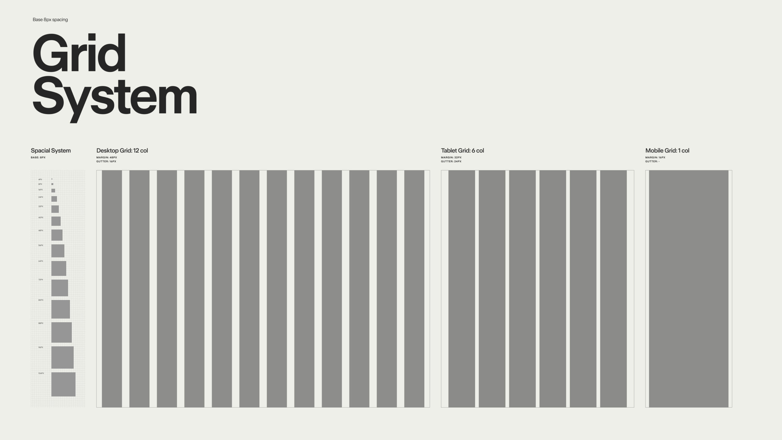
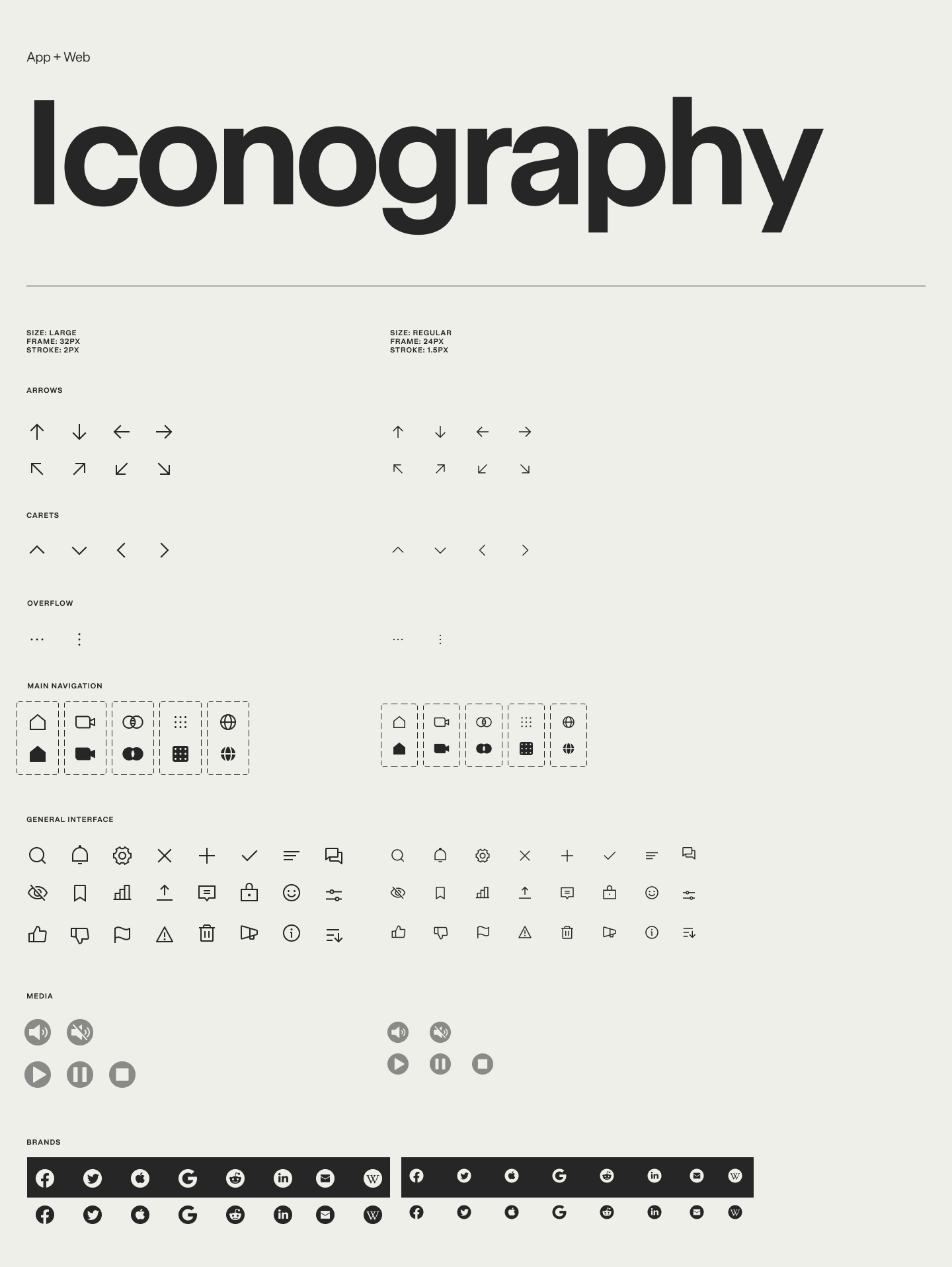
With the identity in place, I worked on establishing a design system to round out the new mark and prepare a set of foundational elements to be shared between the brand and the digital products.
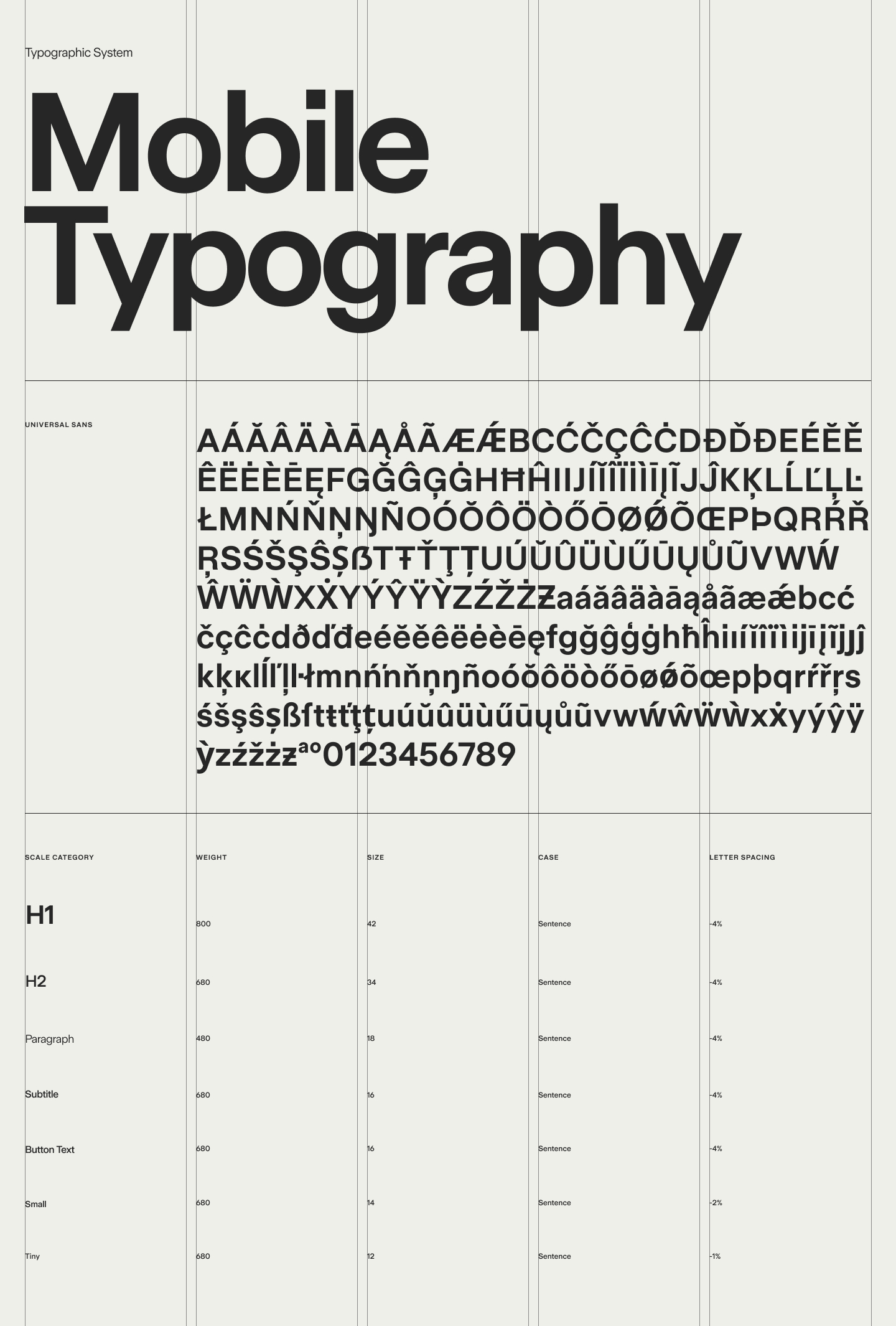
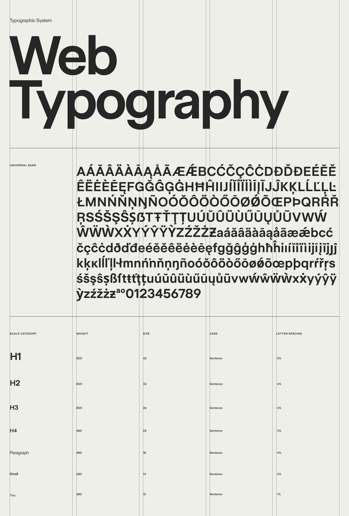
Typography
As an editorial experience, it was important to create a typographic system that optimized for legibility on digital screens while maintaining a neutral look and feel. I established a system using Universal Sans in three different weights to suit the needs of Ground's digital products.
Desktop and mobile type scales were made for a more seamless developer hand-off, as well as serving as a tool for us to keep track of the many styles we were creating.
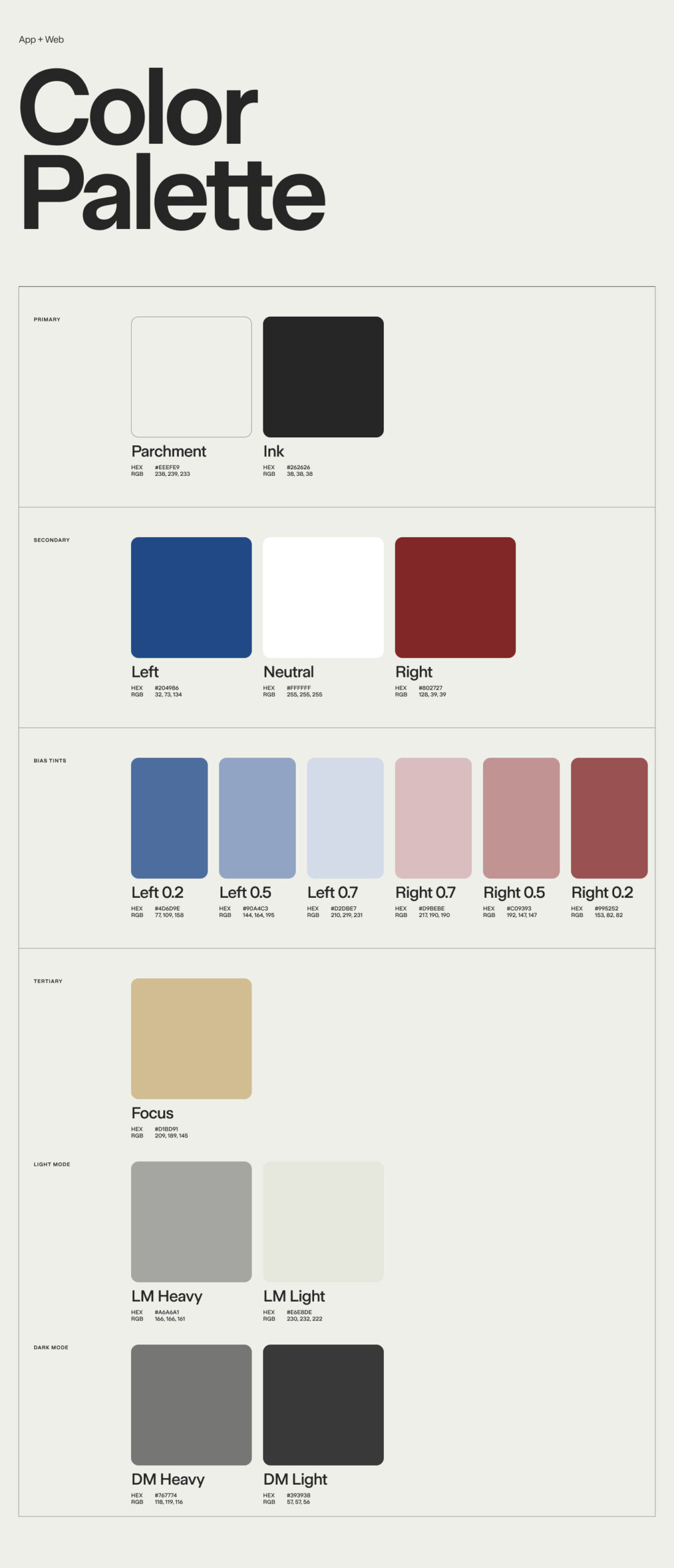
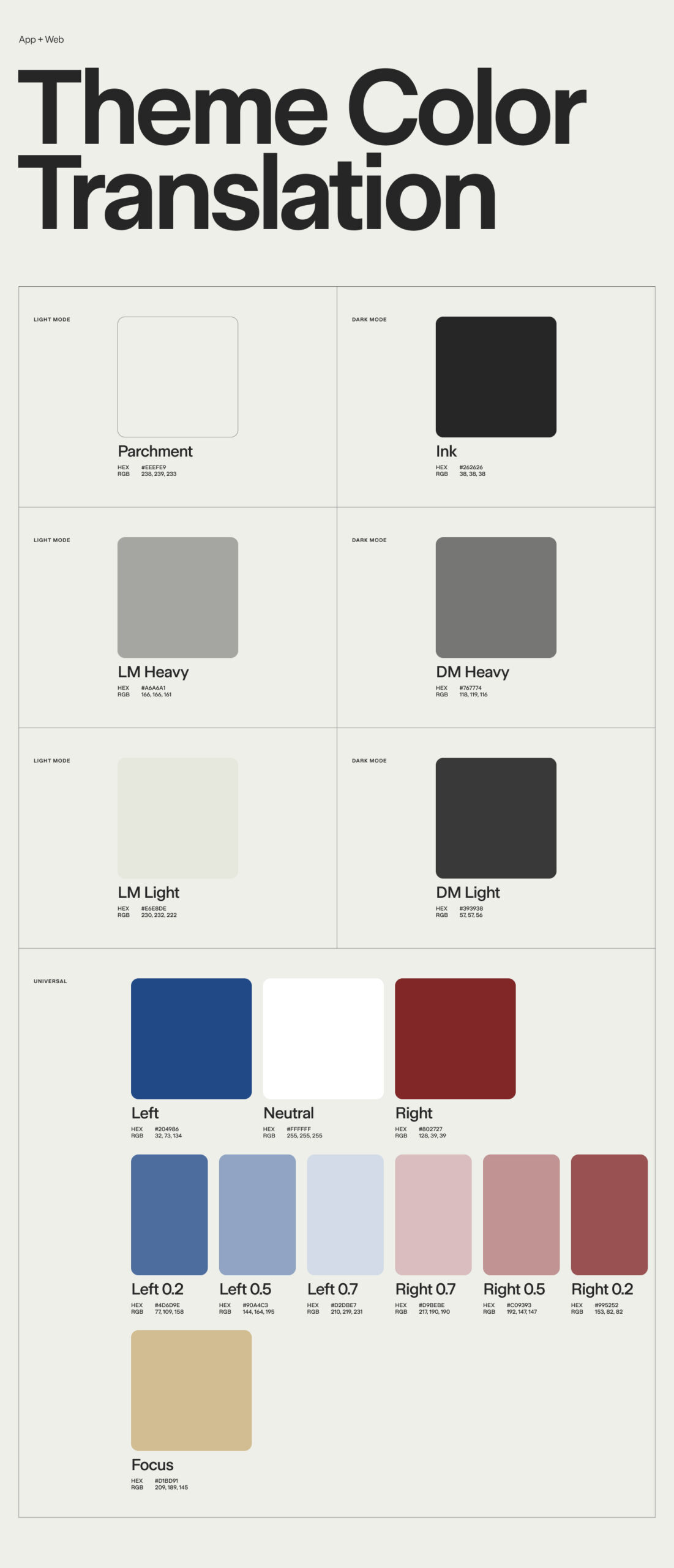
Color
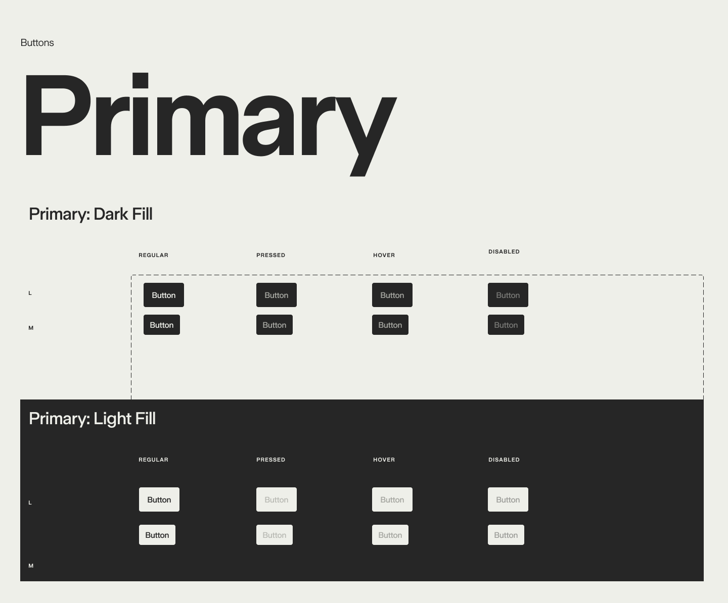
Previously, Ground was using a mix of colors to highlight their brand, indicate political bias, and as design elements within the product. We created a primary palette inspired by the natural discoloration that occurs on newspaper and the soft, ink-like blacks of the relief printing process. The secondary colors are a refined set to clearly indicate bias. The tertiary palette works across various UI elements in both dark and light reading modes. Together, this new palette created an easily understood taxonomy of brand vs. political bias colors.
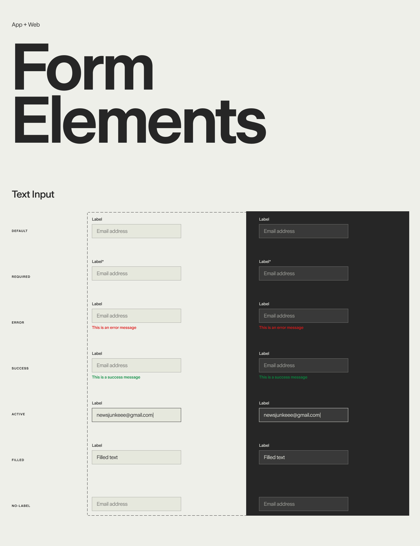
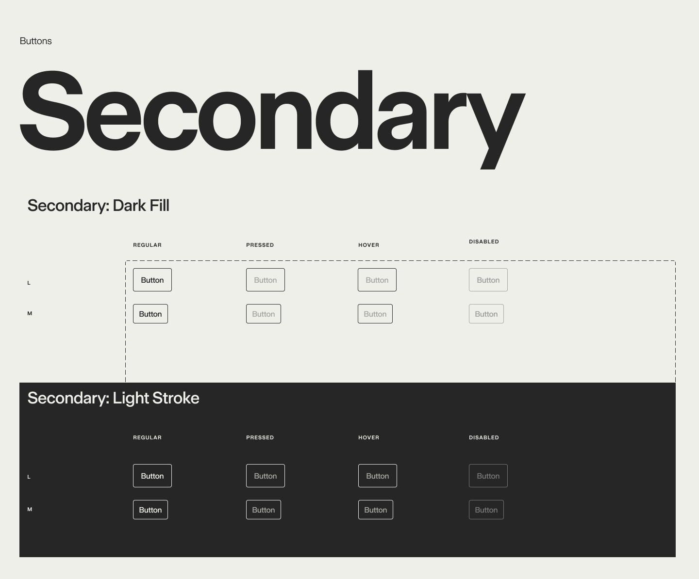
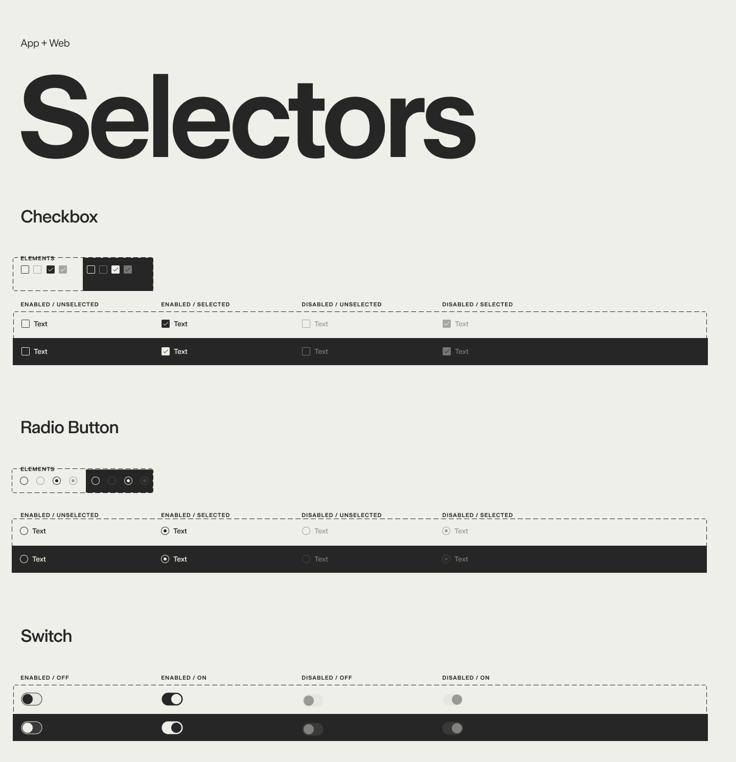
After establishing the foundational tokens of the design system, I progressed to elements and eventually set core patterns for both the web and mobile app experience.
It was important to create thorough documentation and clear usage guidance for the internal design team at Ground. Below are pages from the working design system that was built and documented in Figma.
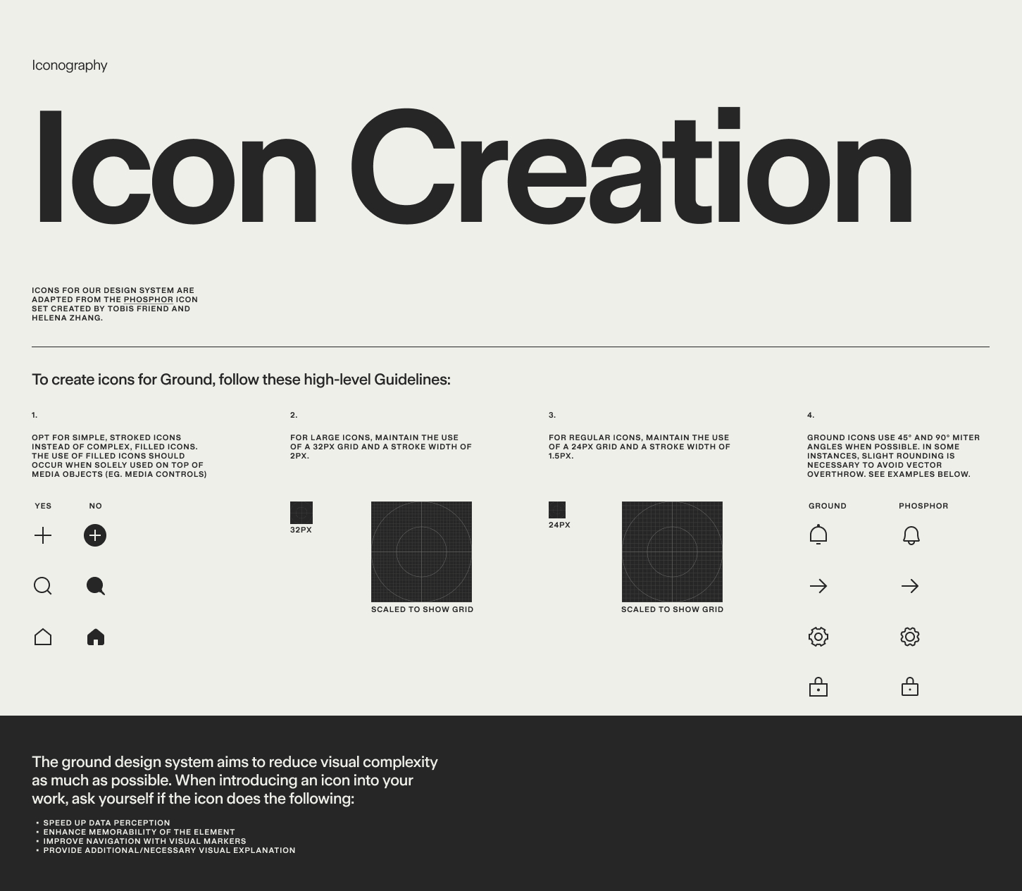
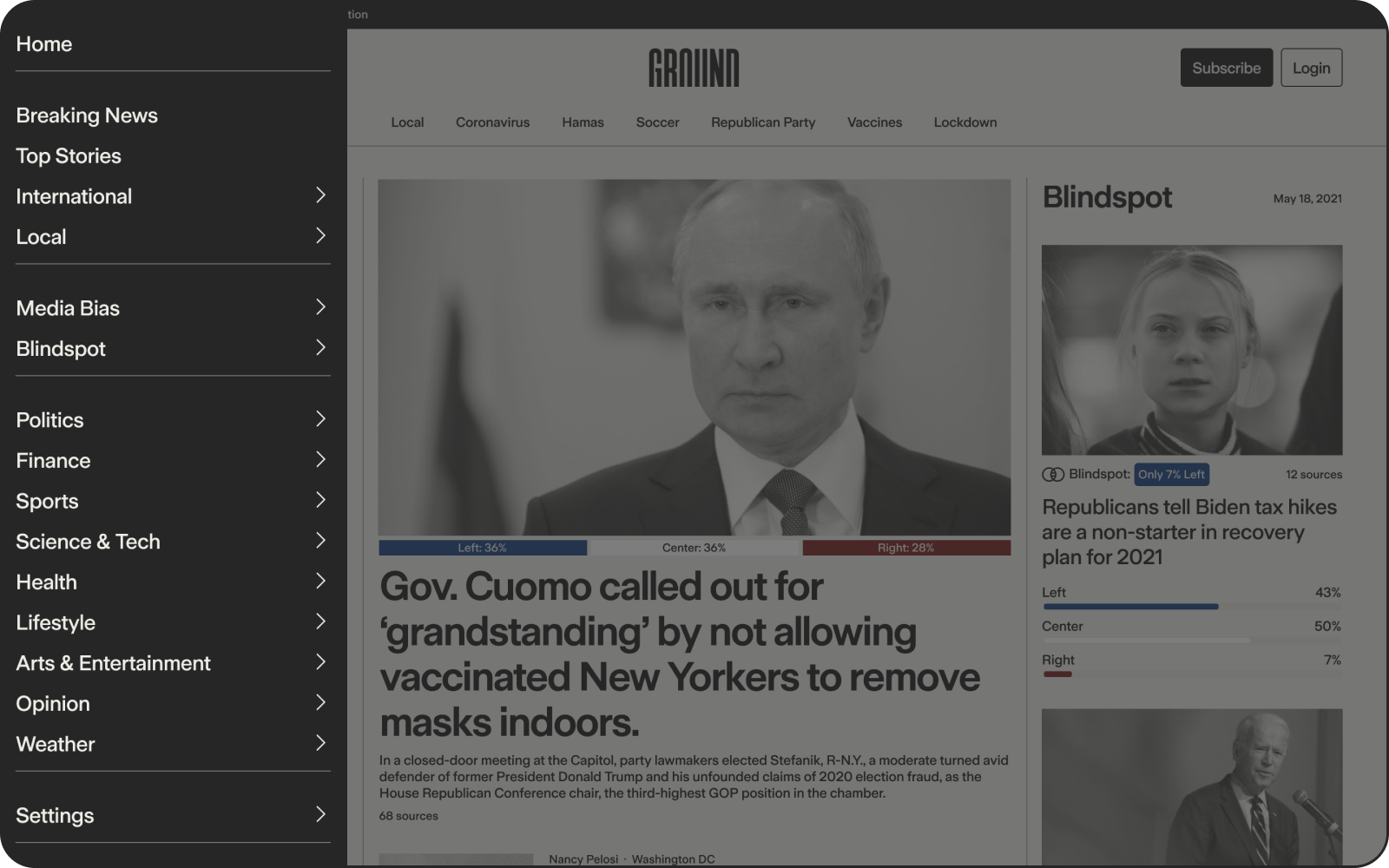
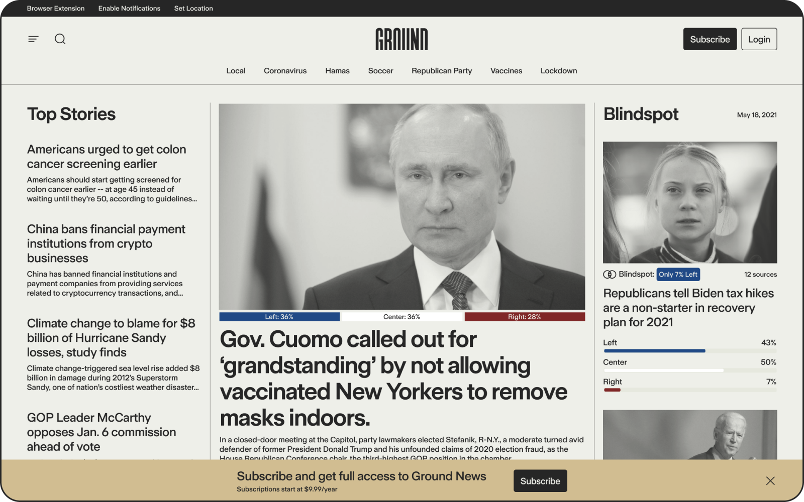
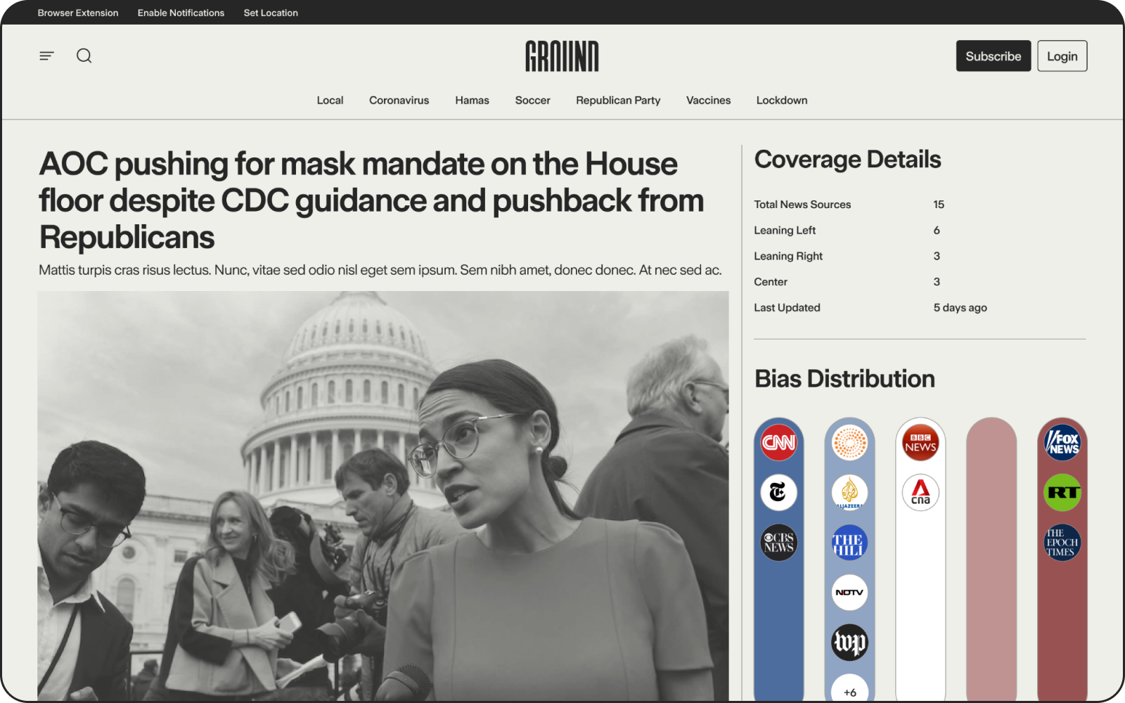
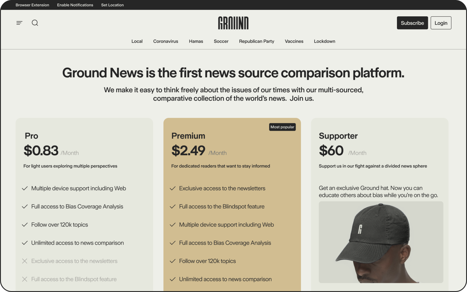
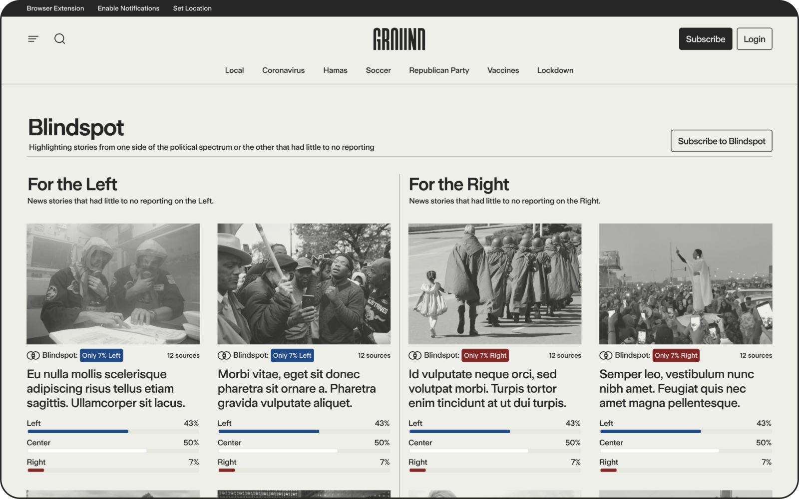
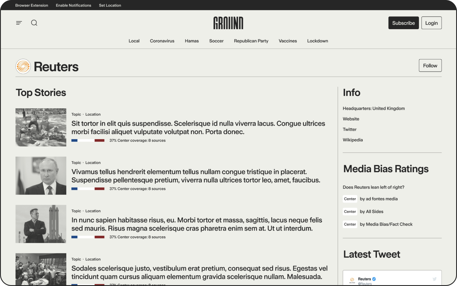
III. DIGITAL PRODUCT
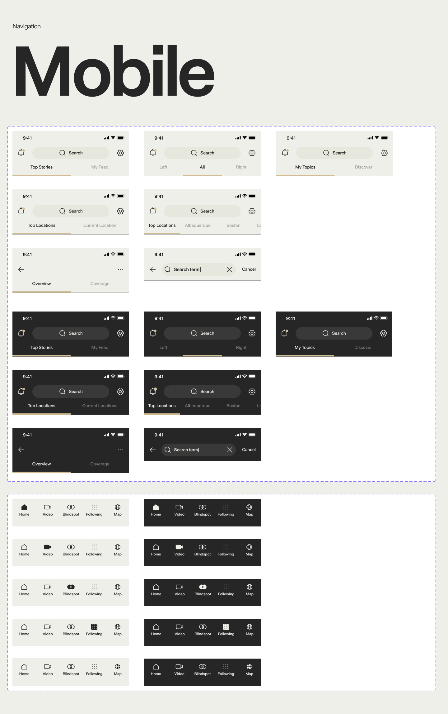
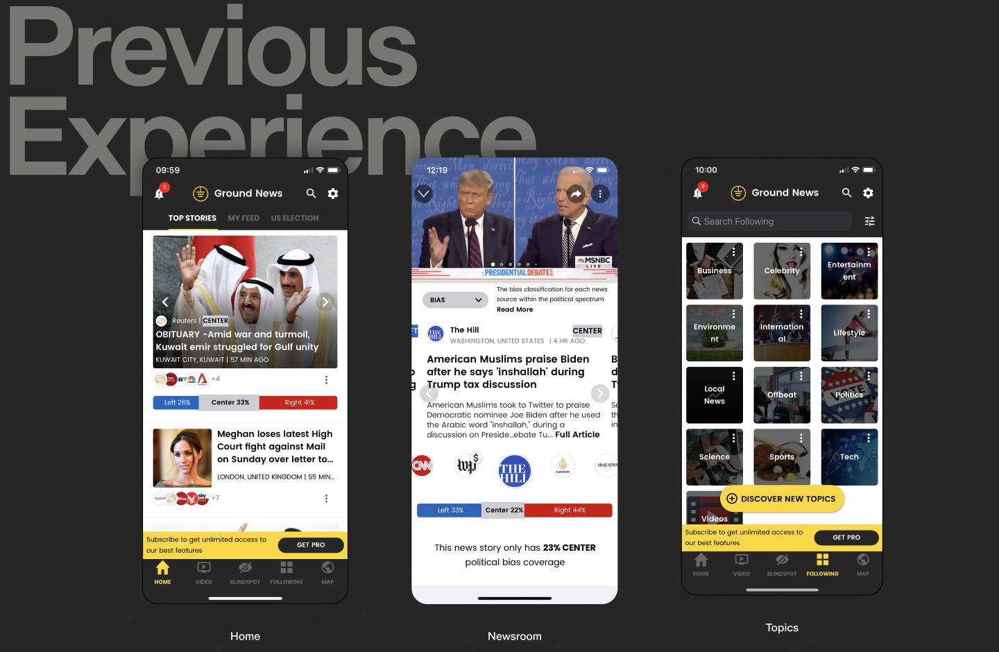
Ground had originally launched in 2017, amassing a notable userbase and brand equity among those who were familiar. It was important to not alienate the current readership with the redesign and create something fresh and new to attract a larger segment of readers while improving the overall user experience.
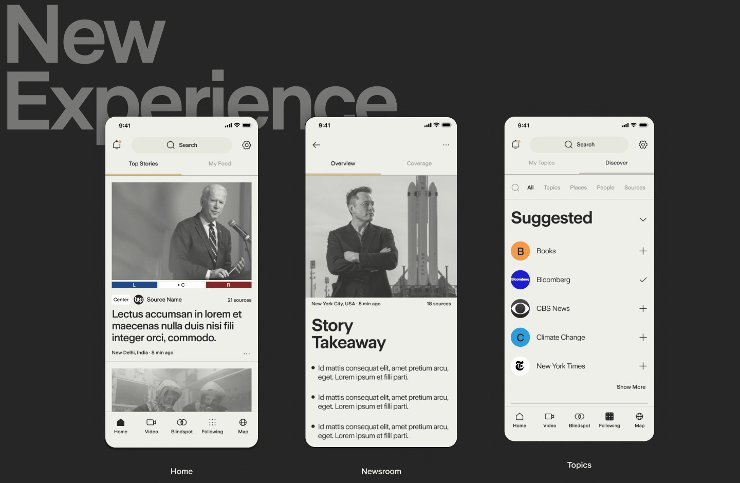
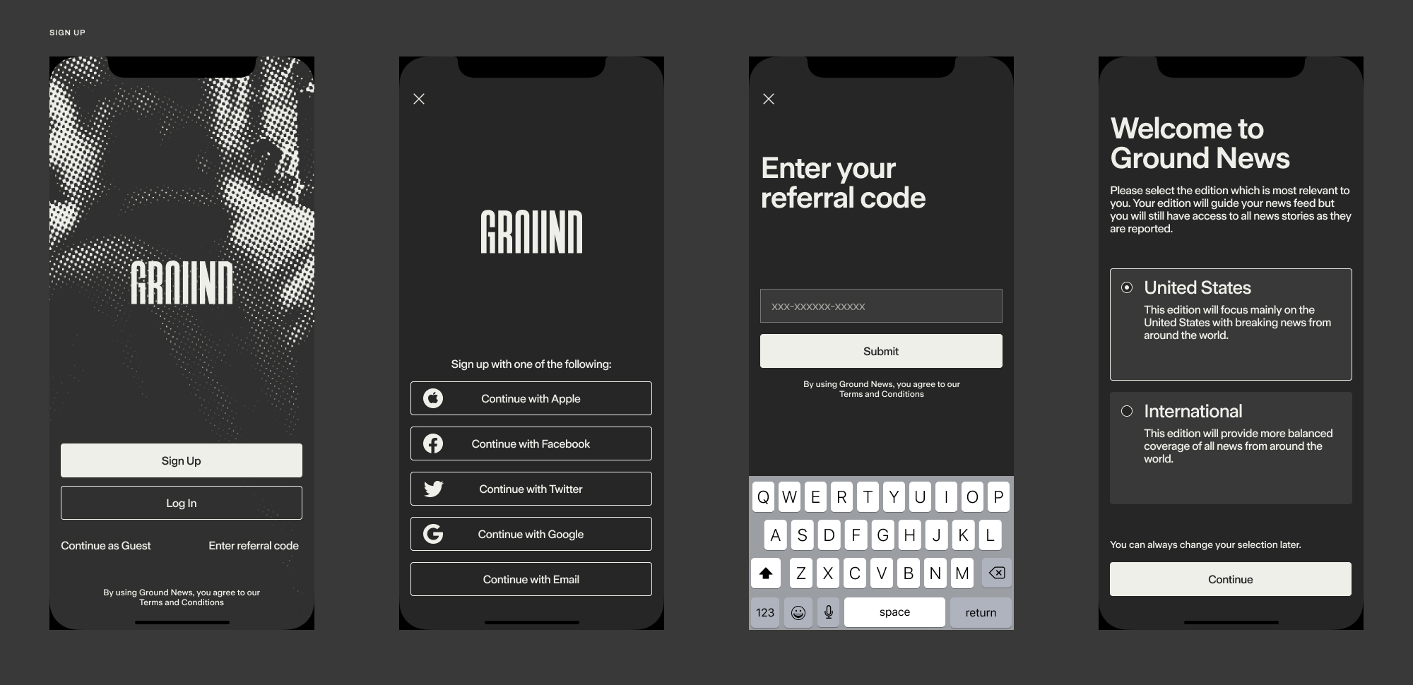
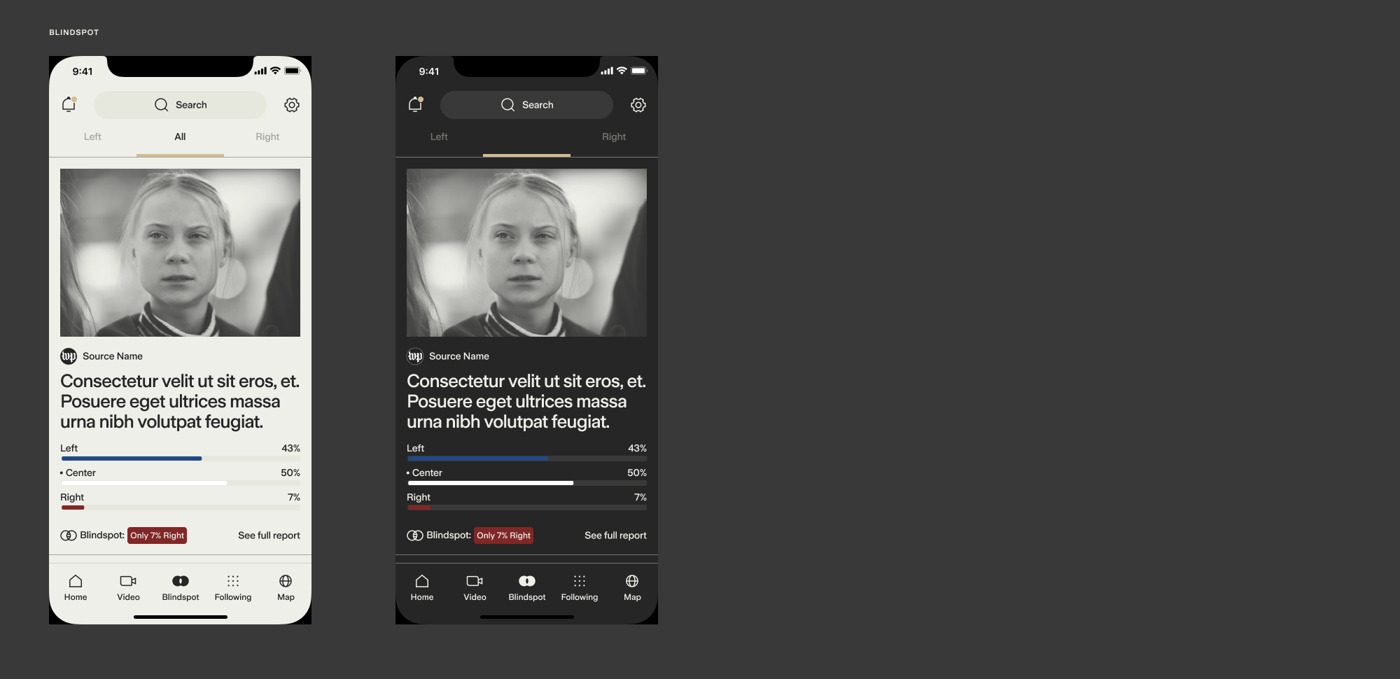
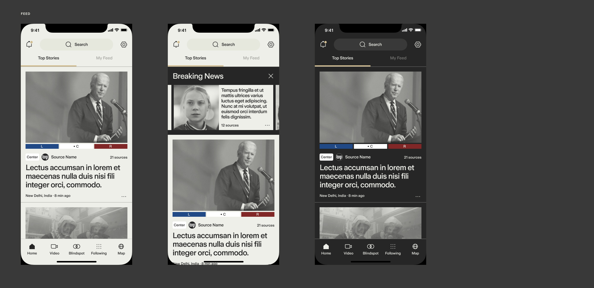
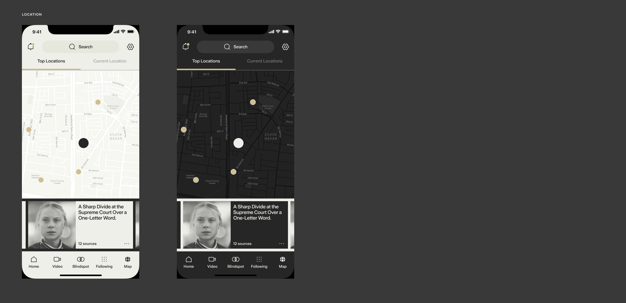
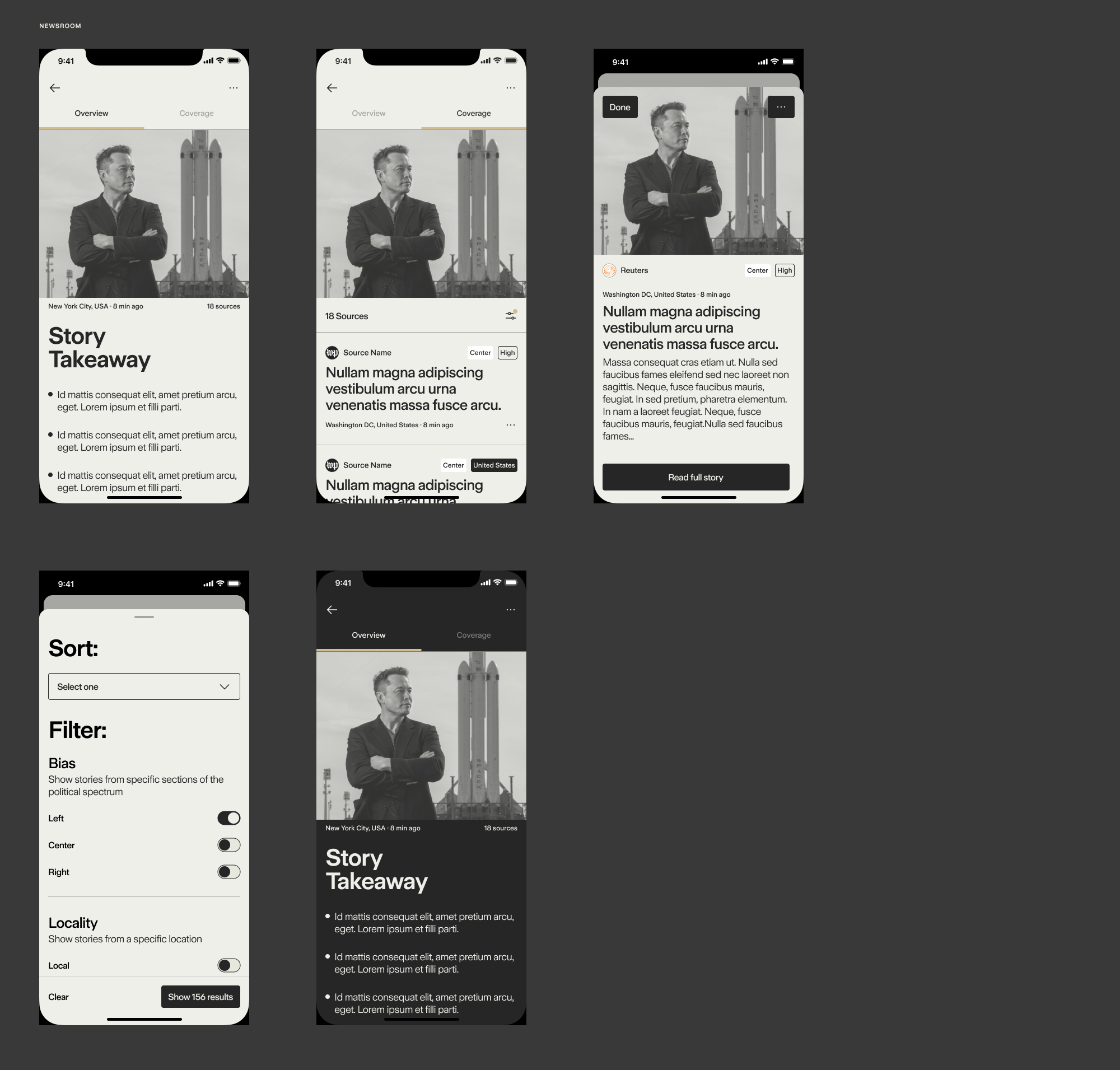
[fig.8] Major moments
I started with the mobile app as an overwhelming majority of readers were using Ground via the app. After identifying the 'major moments' of the experience, these key screens helped me round out the design system, and align with the internal team at Ground on some updated UX changes that would be folded into the redesign.
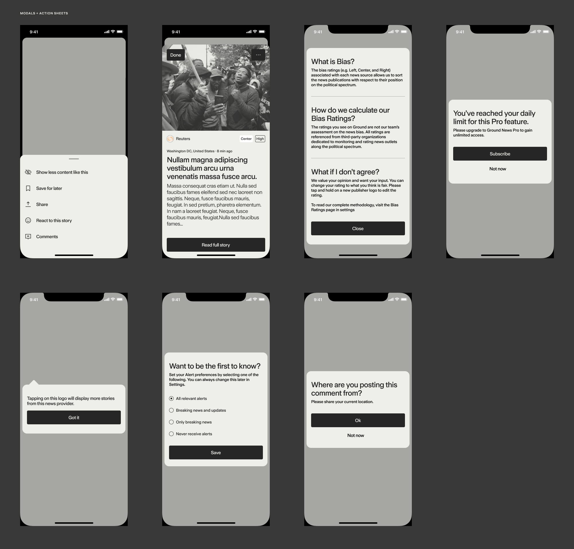
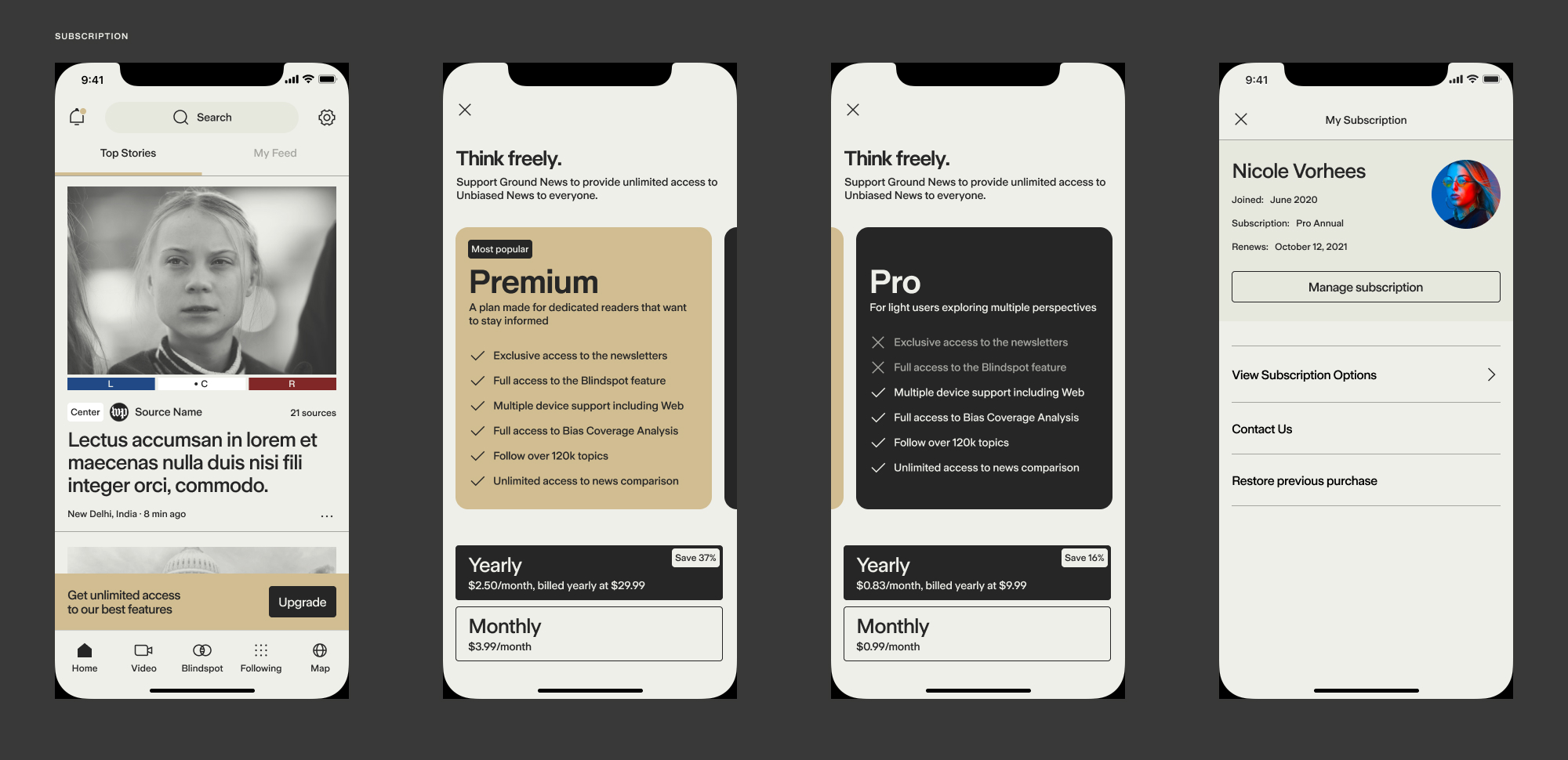
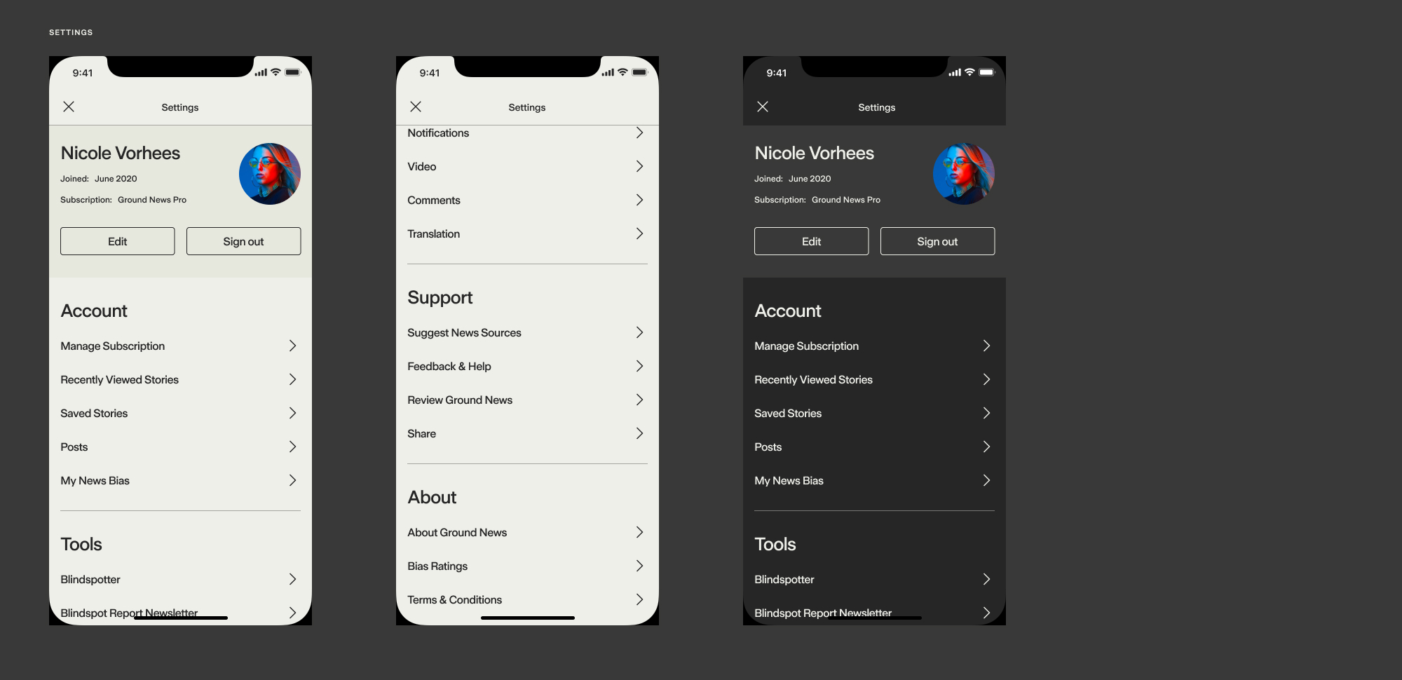
[fig.9] Full set of screens delivered
Because the Ground team is decentralized and fully remote, I used prototypes to better communicate flows and interaction ideas with stakeholders and development partners.
[fig.10] Prototypes
High-fidelity interactive prototypes from various stages in the design process
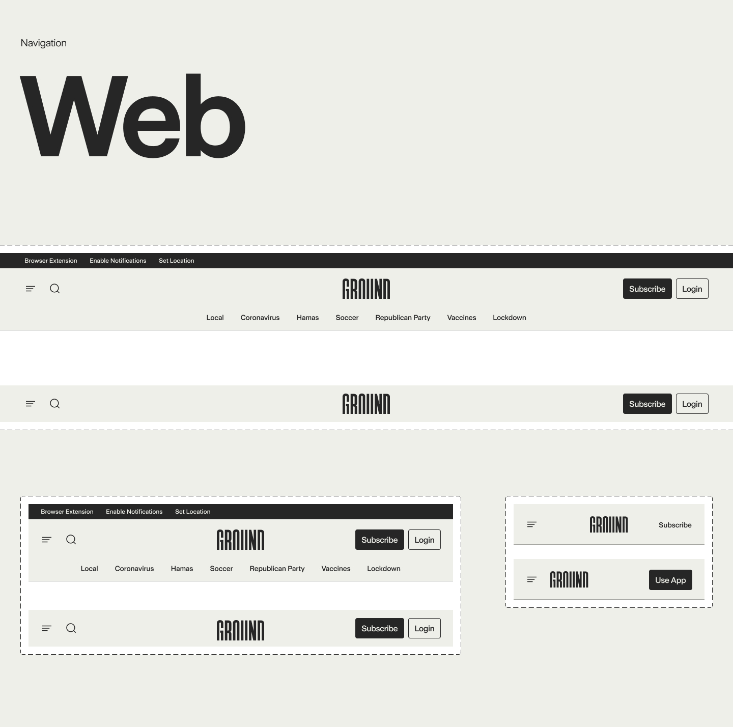
[fig.11] Web experience
I approached the web with similar considerations for current and new readers — aiming for the redesign to feel new yet familiar enough to use without creating additional cognitive friction.
⚘ Download the current version of Ground for iOS and Android or visit www.ground.news